Week 08: Designing on a Grid
With layout basics behind us, we explore grid design and the use of CSS frameworks for rapid development.
News Package Critique
- Group 1: Shang S, Nicole W.
- Group 2: Alyssa P, Jeremy L.
Exercise 1: Creating a basic Bootstrap Website
When instructed in class, follow this step-by-step tutorial until you get to Exercise 2, then stop.
When you finish, raise your hand and have one of the instructors or GSRs check your work. This is important because Exercise 2 will build off this lesson, so this should be correct before moving forward.
Step 1: Download Bootstrap Library
First, we will download the Bootstrap CSS framework. Visit the Bootstrap website, then click on the Download button.
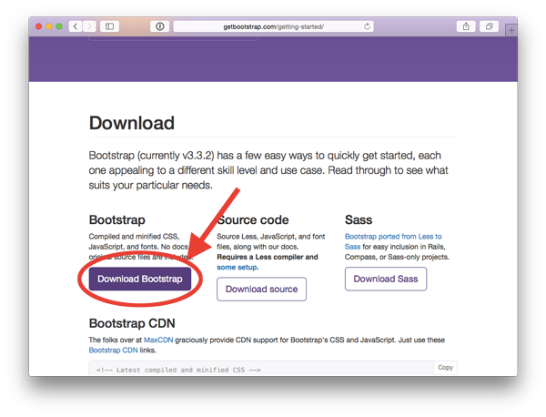
Create a new folder somewhere on your computer where you will produce the rest of these exercises. Name this new folder grid-project-folder. This will be your “project folder” from here on out.
Move the bootstrap-x.x.x-dist.zip file into that project folder you just created, and extract the files by double-clicking on the bootstrap zip.
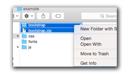
Next, move the css, js, and fonts folders back one level, so they are outside the bootstrap folder, and in the main project folder. You can now delete the empty bootstrap folder and bootstrap.zip file you had downloaded.
Step 2: Creating a Bootstrap template webpage
Using a plain text editor (e.g Sublime, Textmate, or Brackets) create a new empty document, and save it into your project folder in the same location where the css, js and fonts folders are located.
Name this new file example1.html.
Next, copy the code below, and paste it into your document and save:
<!DOCTYPE html>
<html lang="en">
    <head>
        <meta charset="utf-8">
        <meta http-equiv="X-UA-Compatible" content="IE=edge">
        <meta name="viewport" content="width=device-width, initial-scale=1">
        <title>Bootstrap 101 Template</title>
        <link href="css/bootstrap.min.css" rel="stylesheet">
        <style>
        /* Your custom CSS styles here */


        </style>
    </head>
    <body>
        <!-- HTML content goes here -->


    </body>
</html>
NOTE: All of the HTML content of your page will go between the <body></body> tags. All of the custom CSS code will go between the <style></style> tags in the head of your document.
Step 3: Creating our container-fluid <div> tag
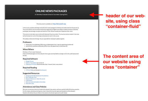
Next, we will create a <div> for the top area of our web page, commonly called the Header portion of a web page. (This is not to be confused with the <head> tag of our HTML.) The header of a website is the top portion that contains the masthead and other branding information.
In the <body> of our website, add the following markup:
<div class="container-fluid">

</div>
Next, Let’s add the title to our webpage as an h1 heading, and h2 sub-heading. Make sure to add these inside the div we just created, AND that you properly indent so that it’s clear these are nested inside the div.
<h1>Online News Packages</h1>
<h2>UC Berkeley Graduate School of Journalism</h2>
Now, view your web page in the browser, and you might notice that the text is on the left side of the screen instead of the middle. We can use a built-in Bootstrap class to fix this.
To our class="container-fluid" attribute, we’re going to add an additional class called text-center. (This will center all text inside this div.) To add multiple classes, you space-separate them within a single class="" attribute.
Change your div tag to the following:
Now check your website in the browser again. The text should be centered.
(Note: In addition to text-center, Bootstrap has a number of text-alignment helper classes.)
Step 4: Create our container <div> tag
Next, we will create the body of our website using the singular container class.
Copy-and-paste this below the div with the header information.
<div class="container">
    <h2>This is a subtitle headline for the content are of the webpage</h2>
    <p>Lorem ipsum dolor sit amet, consectetur adipisicing
    tempor incididunt ut labore et dolore magna aliqua. Ut
    quis nostrud exercitation ullamco laboris nisi ut aliq
    consequat. Duis aute irure dolor in reprehenderit in
    cillum dolore eu fugiat nulla pariatur. Excepteur sint
    proident, sunt in culpa qui officia deserunt mollit</p>
</div>
Step 5: Style our page
We will apply some manual style overrides.
In order to apply some styles specifically to each div tag independently, we need a way to reference them individually. One way is to add a unique class name to each div:
<div class="container-fluid text-center header">
...
</div>
<div class="container content">
...
</div>
Notice in the code above, we added two new classes to our div tags, header and content. This allows them to reference them in our CSS code using the selectors .header and .content.
For our new selectors, let’s create a background similar to this tutorial website.
.header{
    background-color: #212121;
    color: white; /* color of the text */
    min-height: 200px;
}
The spacing might be a little off. So let’s add some margin-top to the h1 tag. However, just in case there are other h1 tags on our page, we can specify only the h1 tags inside our header by using the following selector:
.header h1{
    margin-top:50px;
}
Feel free to add additional styles if there is time. But stop here until the instructor delivers the next portion of the lecture.
(Stop here until the instructor tells you to proceed.)
Exercise 2: Creating a Basic Grid Layout
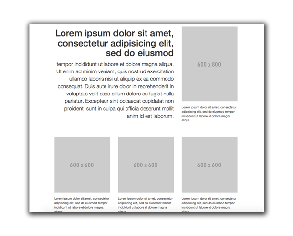
In this exercise, we will create the following layout:
Create a new document in your plain text editor, and save the file as example2.html in the same project folder you’ve been working on this whole time. This location is important, because it will need to access the CSS folder and other files.
Step 1: Create a basic template
This part should be familiar. Copy the following code into your blank document and save.
<!DOCTYPE html>
<html lang="en">
    <head>
        <meta charset="utf-8">
        <meta http-equiv="X-UA-Compatible" content="IE=edge">
        <meta name="viewport" content="width=device-width, initial-scale=1">
        <title>Bootstrap 101 Template</title>
        <link href="css/bootstrap.min.css" rel="stylesheet">
        <style>
        /* Your custom CSS styles here */


        </style>
    </head>
    <body>
        <!-- HTML content goes here -->


    </body>
</html>
Step 2: Create the Container and Row divs
Next, we will create some div tags to hold our content. We will use the container to keep our content in the middle of the page, and an initial row div in order to use the Grid System.
<div class="container">
    <div class="row">

    </div>
</div>
Step 3: Create a set of columns for the first Row
In this step, we will describe what to do, but won’t be giving you code to copy-and-paste. Follow closely.
Inside your first row, create two <div></div> tags; the first will have the class col-sm-8 and the second one will have the class col-sm-4. Do not put one div tag inside the other, rather they should be next to each other.
This will have created two boxes, the first is eight columns, and the second four columns, for a total of 12 columns.
Step 4: Add header content
In the first eight-column div, let’s add some content. Feel free to copy-and-paste the following:
<h1>Lorem ipsum dolor sit amet, consectetur adipisicing elit, sed do eiusmod</h1>

<p class="lead">tempor incididunt ut labore et dolore magna aliqua.
Quis nostrud exercitation ullamco laboris nisi ut aliquip ex ea
consequat.</p>

<p>Duis aute irure dolor in reprehenderit in voluptate velit esse
cillum dolore eu fugiat nulla pariatur. Excepteur sint occaecat
proident, sunt in culpa qui officia deserunt mollit anim id est.</p>
Note the class="lead". This is a built-in Bootstrap class that will make the lead text slightly larger than the standard paragraph text.
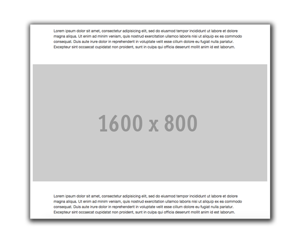
Step 5: Add placeholder image to header
Next, let’s add a placeholder image to the four column box. Paste the following code to the four-column div box.
<img src="http://placehold.it/600x800" class="img-responsive center-block" />

<p class="small">Lorem ipsum dolor sit amet, consectetur adipisicing elit,
tempor incididunt ut labore et dolore magna aliqua.</p>
Note the class="small" on the p tag. This is a build-in Bootstrap class that makes text small, which is useful for a photo caption.
Step 6: Adding some text-alignment classes
In order to get the web page to look like our example image, we need to align the text to the right. Add text-right class to the eight column box. Remember, to have multiple classes, you need to space separate them.
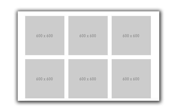
Step 7: Adding the three boxes below
Based on everything you’ve just done, add three additional images in the next row. We won’t give you the code to do this. Try basing it off the model we just completed with the first part.
The process will go like this:
- Add a div with class row
- Add some columns that add up to 12 (you can use the sm breakpoint)
- Paste in the content to each.
Here is the content to go in each box.
<img src="http://placehold.it/600x600" class="img-responsive center-block">
<p class="small">Lorem ipsum dolor sit amet, consectetur adipisicing elit,
tempor incididunt ut labore et dolore magna aliqua.</p>
Exercise 3: More sophisticated layouts
If you finish early and there is time, try creating the following layouts on your own.
In the layout above, there is a full-width image that takes up the whole screen. To accomplish this, you will have to close your container div, and create a new container-fluid div, then add the image. For consistency, it’s a good idea to create a row and 12 column box, even if it might seem superfluous.
After that, then you will need to close the container-fluid, and add back a new container div.
Exercise 4: Combining multiple grid breakpoints
In this exercise, combine multiple breakpoints so that there is a grid of photos that appears 6x2. But as the browser viewport collapses, it becomes two side-by-side columns of photos to form a 2x6 grid.
To get the space above and below the photos, you’ll need to add some custom CSS in the top of your document. Give all these images a class name called grid-photo in addition to the img-responsive they should all already have.
.grid-photo{
    margin-top:15px;
    margin-bottom: 15px;
}
HOMEWORK
Your homework is to re-create a web page that looks like this:
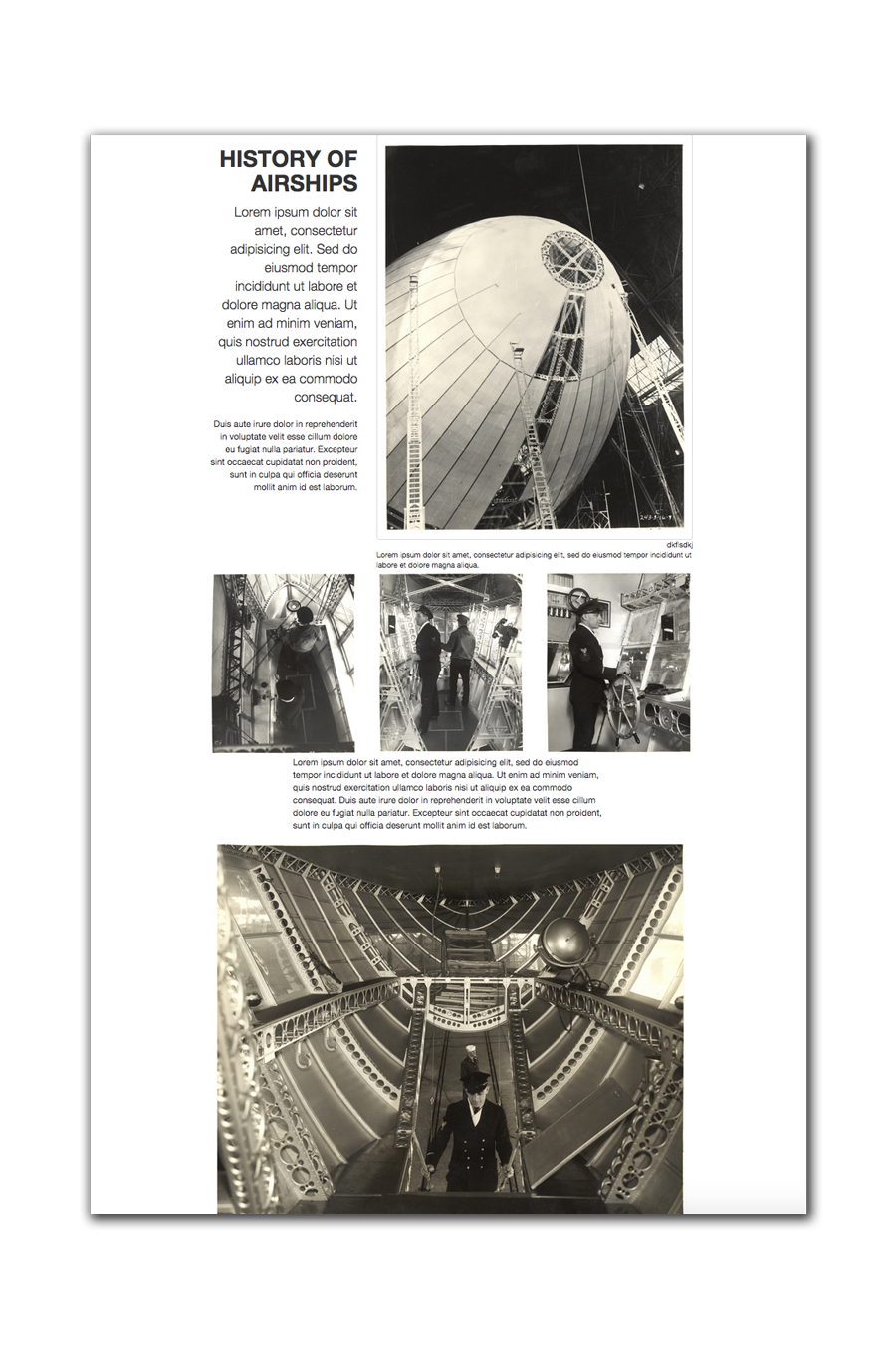
The images are in the National Archives Flickr account. Here are links to the specific images:
<!-- Main photo -->
<img src="https://farm9.staticflickr.com/8180/7951497614_113792e785_b.jpg" class="img-responsive left-block">

<!-- Three inner photos -->
<img src="https://farm9.staticflickr.com/8455/7951500278_837f104ba4_b.jpg" class="img-responsive center-block">
<img src="https://farm9.staticflickr.com/8447/7951500518_9bbb519d69_b.jpg" class="img-responsive center-block">
<img src="https://farm9.staticflickr.com/8436/7951500812_345455ef6b_b.jpg" class="img-responsive center-block">

<!-- bottom photo -->
<img src="https://farm9.staticflickr.com/8454/7951499264_f11426c1b6_b.jpg" class="img-responsive center-block">
One you finish, zip up the whole folder, including Bootstrap’s css, js and fonts folders, and upload to bCourses. This is due after Spring Break.